
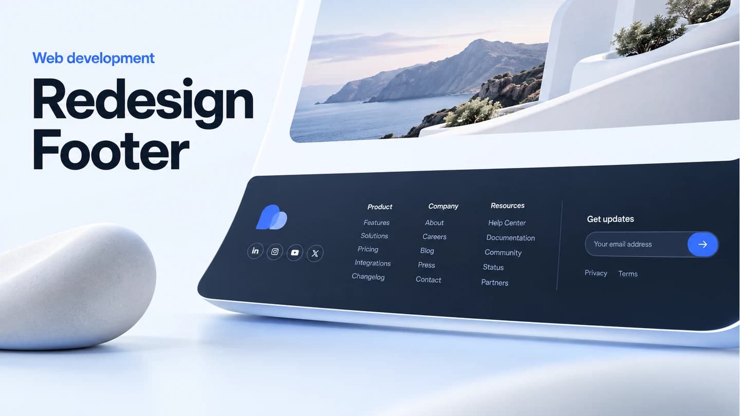
Redesign Footer
Create a polished, responsive footer with clear links and social channels.
$41.03MRP $48.40
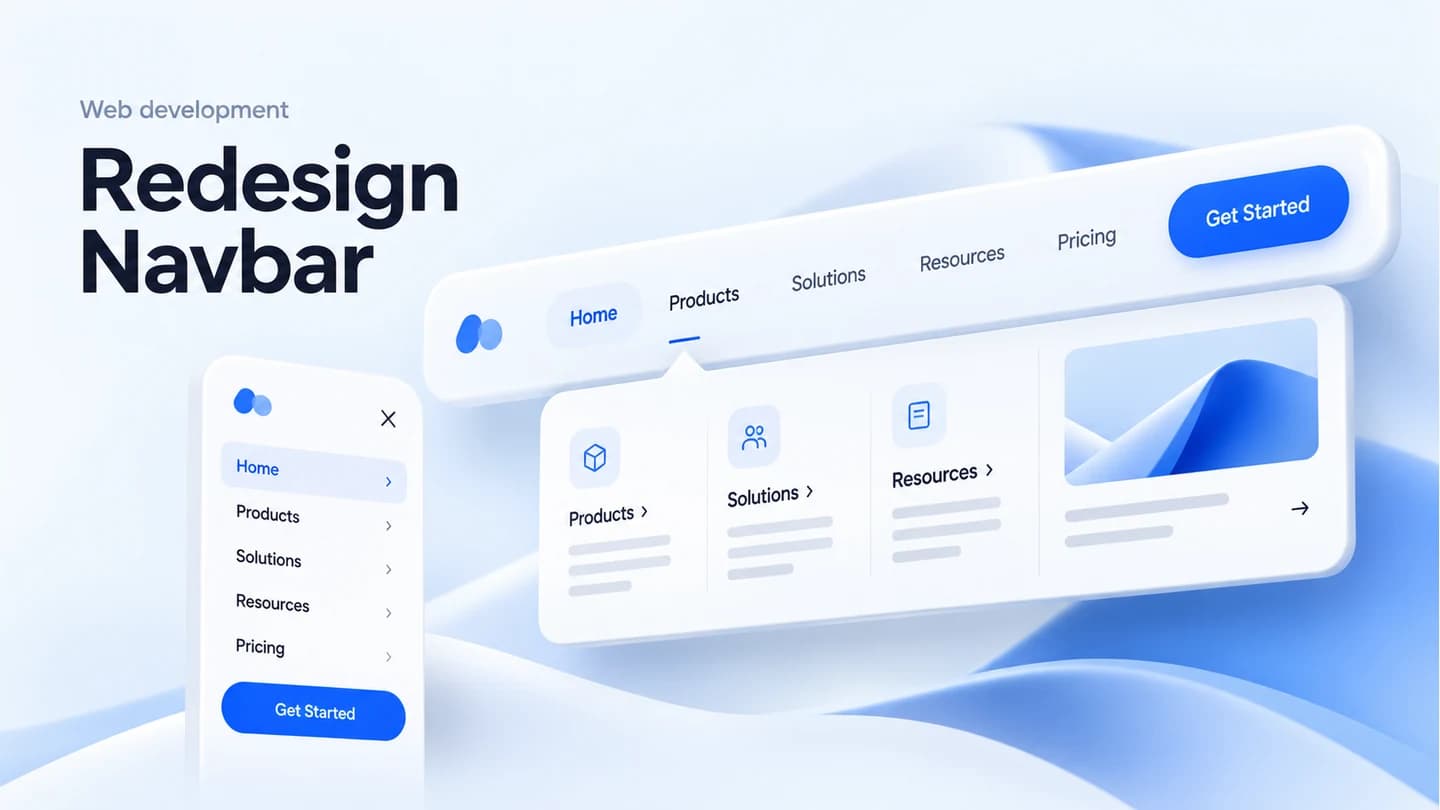
24–72hrA fresh, modern navigation bar that improves usability and matches your brand. Includes mobile hamburger menu, smooth animations, and accessibility best practices.
In this package
New navbar design - fully built, tested, and documented for direct use in production.
Mobile responsive menu - fully built, tested, and documented for direct use in production.
Smooth open/close animations - fully built, tested, and documented for direct use in production.
Accessibility markup - fully built, tested, and documented for direct use in production.
Cross-browser testing - fully built, tested, and documented for direct use in production.
The plan
Full scope
Sites with outdated or clunky navigation that hurts user experience.
Compare other Web Development packagesKeep an active project moving over the weekend to meet a Monday deadline.
Design and build one more page that matches your existing site or app.
Add custom scroll, hover, page transition or loading animations to your project.
Add a new user role with its own permissions and matching interface controls.
Create a polished, responsive footer with clear links and social channels.
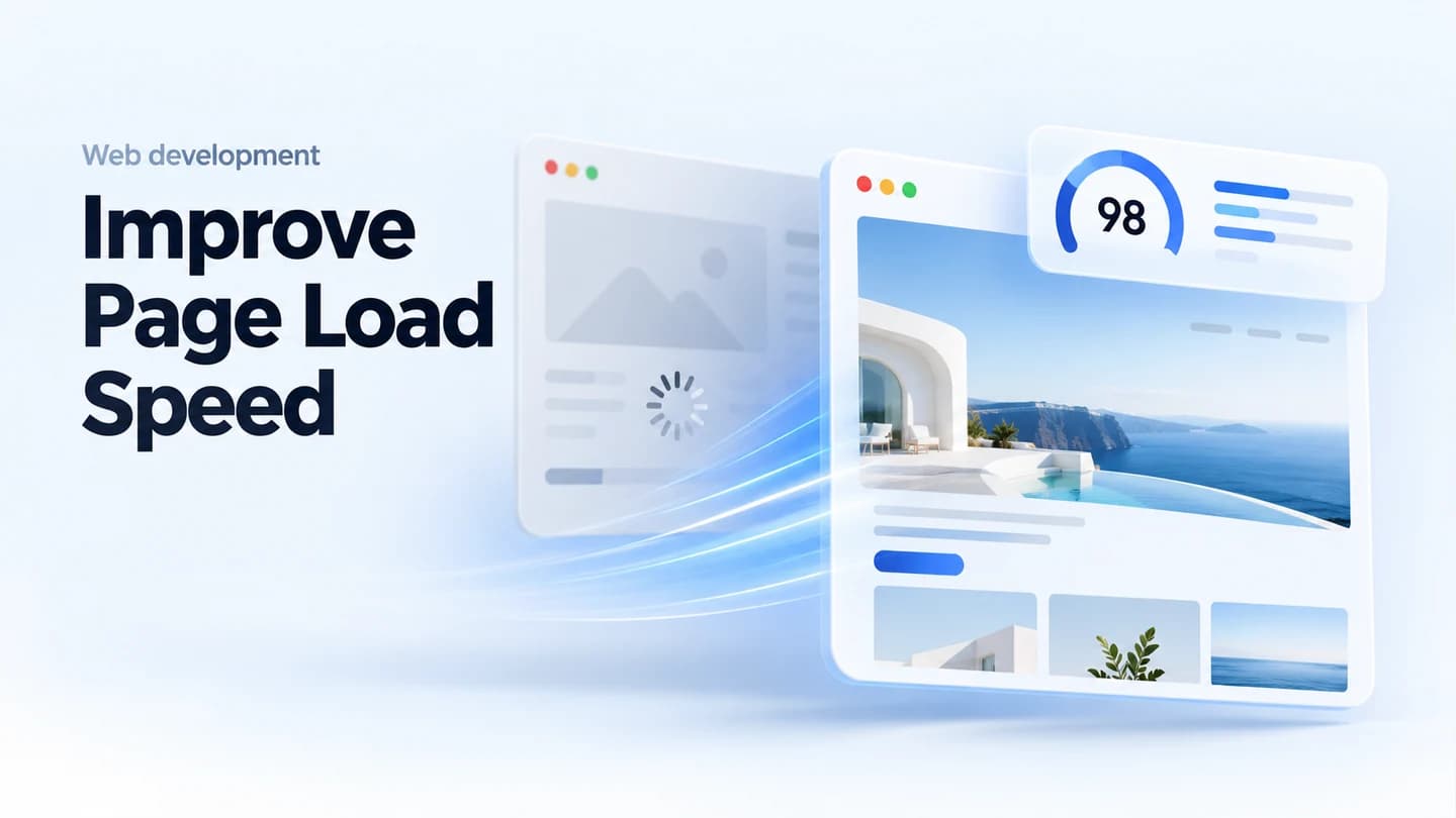
Speed up your site with image, code and caching improvements, then verify gains.
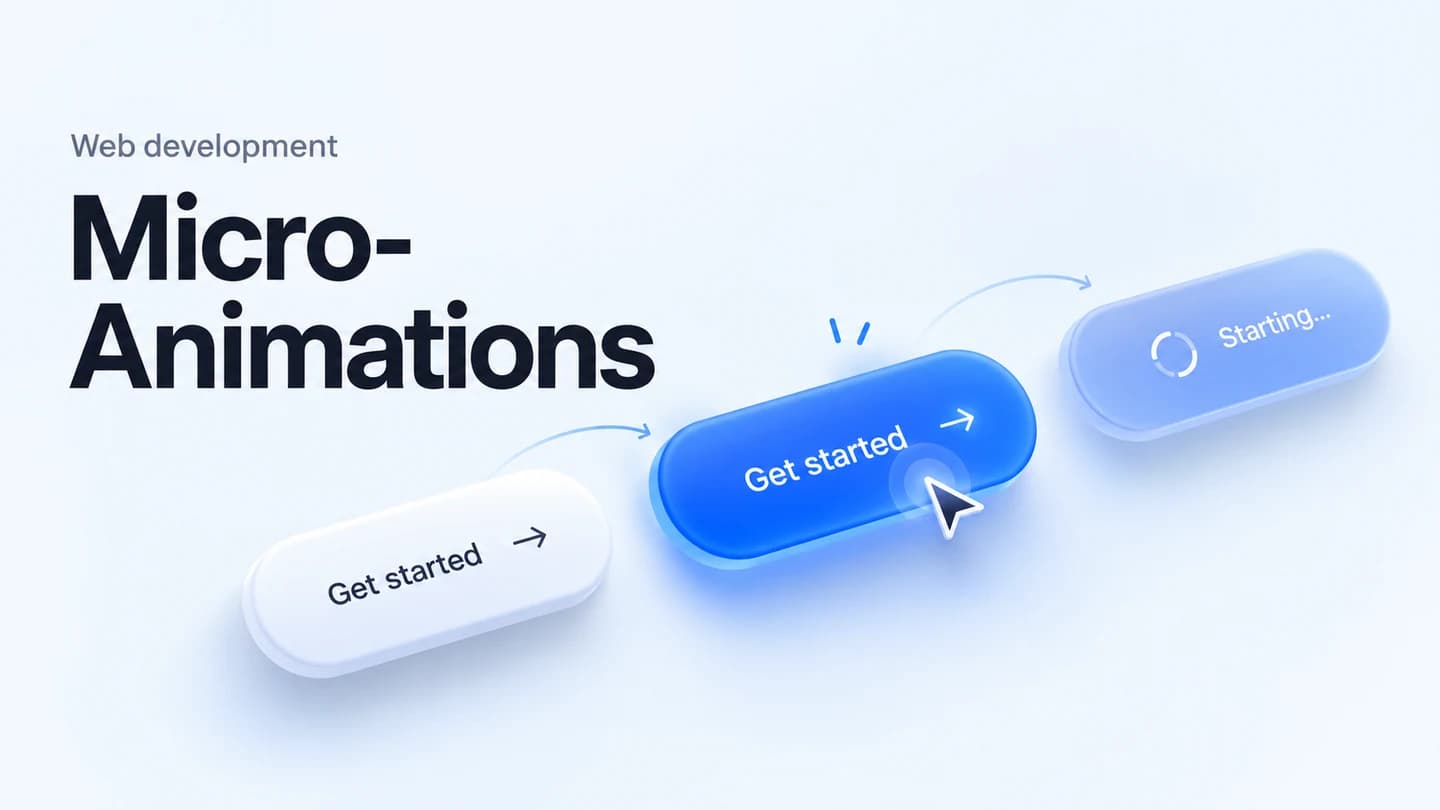
Add polished hover, button, scroll and loading animations without slowing pages.
Add a branded dark theme with system detection and a saved user preference.
New navbar design, Mobile responsive menu, Smooth open/close animations, Accessibility markup, Cross-browser testing
Estimated 24–72hr after kickoff