
Single Screen UI
Design one polished, responsive screen with developer-ready handoff.
$115.73MRP $131.53
3–5 daysA comprehensive design system with design tokens, component library, typography scales, colour palettes, spacing system, and documentation. Your design language, codified.
In this package
Design tokens (colours - fully built, tested, and documented for direct use in production.
spacing - fully built, tested, and documented for direct use in production.
typography) - fully built, tested, and documented for direct use in production.
Component library (40+ components) - fully built, tested, and documented for direct use in production.
Variant system - fully built, tested, and documented for direct use in production.
Dark mode support - fully built, tested, and documented for direct use in production.
Icon system - fully built, tested, and documented for direct use in production.
Documentation - fully built, tested, and documented for direct use in production.
The plan
Full scope
Scaling companies needing visual consistency across products and teams.
Compare other UI/UX & Product Design packagesKeep an active project moving over the weekend to meet a Monday deadline.
Design and build one more page that matches your existing site or app.
Add custom scroll, hover, page transition or loading animations to your project.
Add a new user role with its own permissions and matching interface controls.
Design one polished, responsive screen with developer-ready handoff.
Design a clear, data-rich dashboard for metrics, charts, tables and controls.
Design an efficient admin dashboard for users, content and analytics.
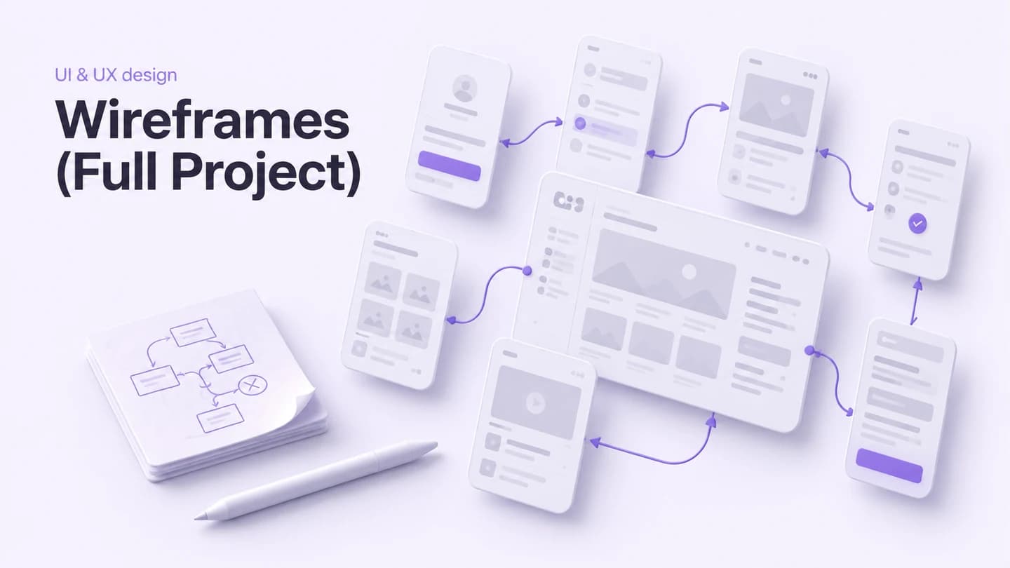
Map user flows and every screen with annotated, low-fidelity wireframes.
Design tokens (colours, spacing, typography), Component library (40+ components), Variant system, Dark mode support, Icon system, Documentation, Figma library setup
Estimated 3–4 weeks after kickoff