
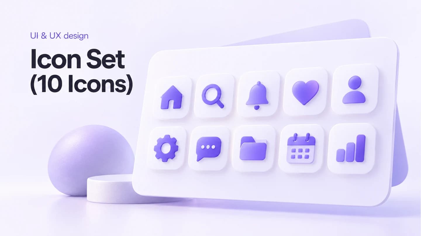
Icon Set (10 Icons)
Design ten consistent brand icons in scalable SVG and multiple sizes.
$75.75MRP $103.12
Thu, 29 OctHaving ideas and references is easy. Turning them into one coherent product experience is the hard part.
Explain the product, its users and the direction you like. Share screenshots, competitors, brand files or half-finished flows. A matched product designer interprets the brief and delivers the work.
Design ten consistent brand icons in scalable SVG and multiple sizes.
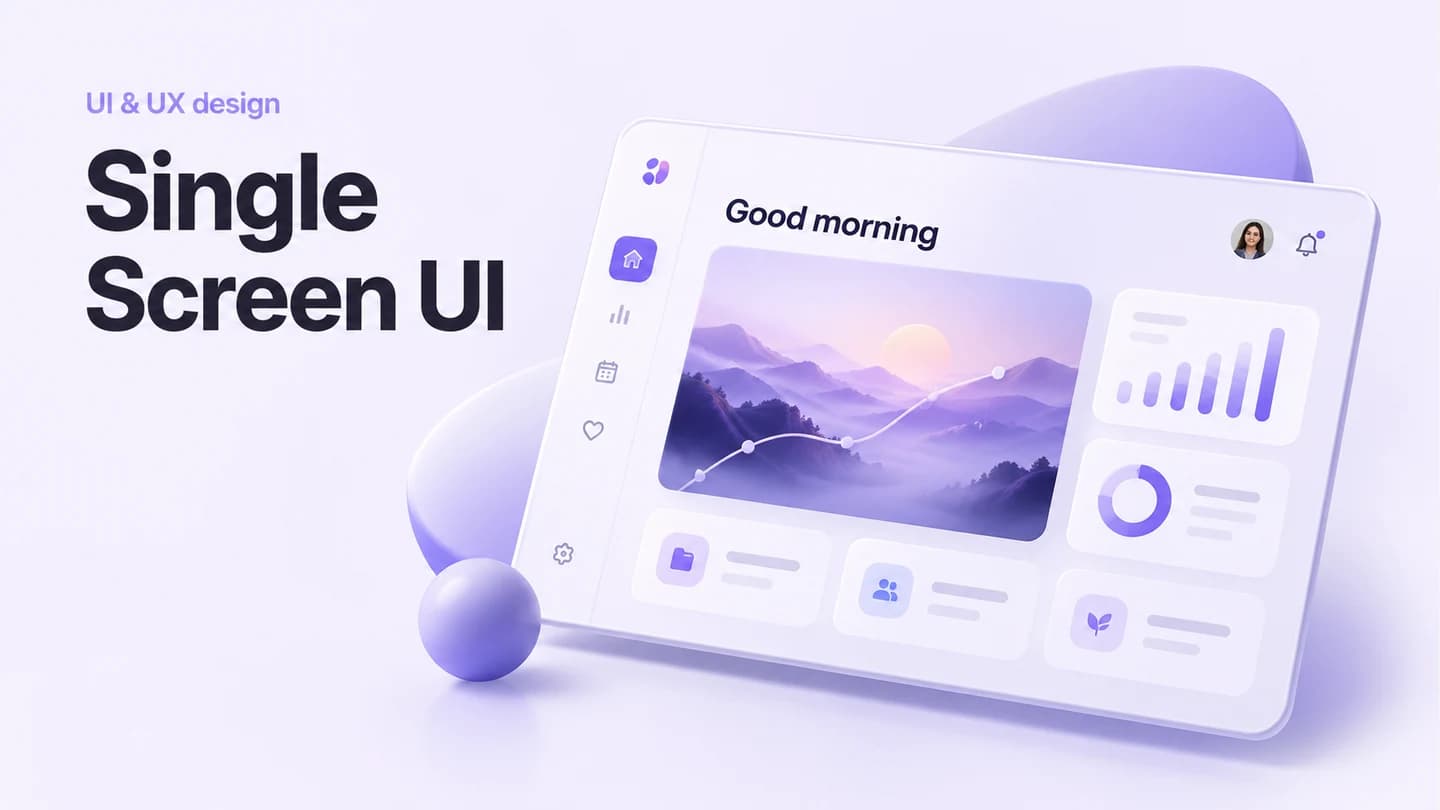
Design one polished, responsive screen with developer-ready handoff.
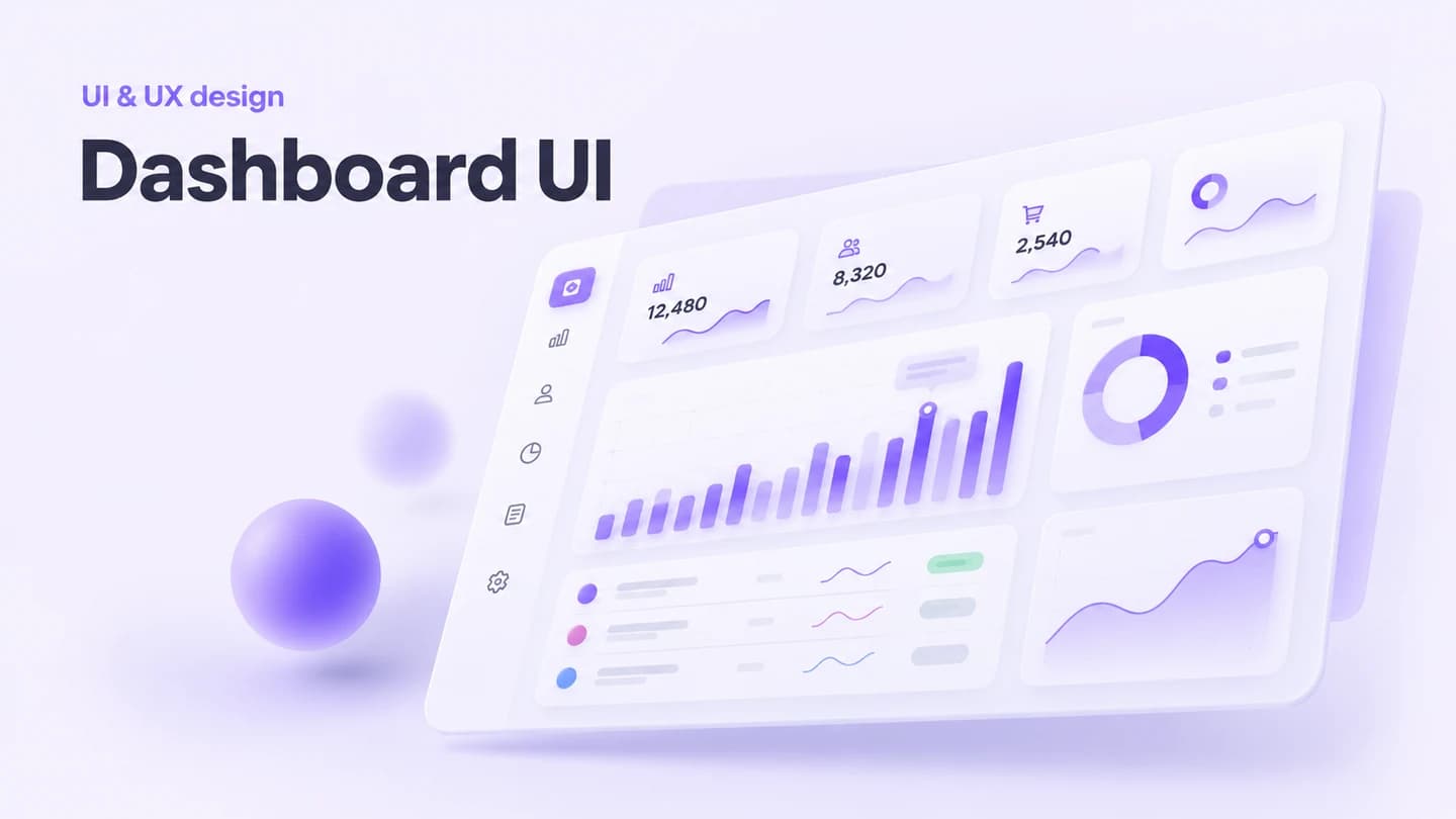
Design a clear, data-rich dashboard for metrics, charts, tables and controls.
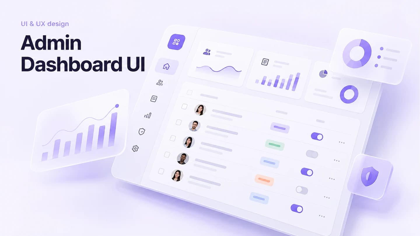
Design an efficient admin dashboard for users, content and analytics.
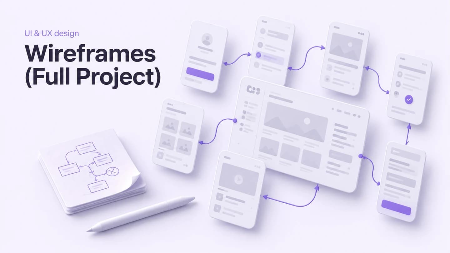
Map user flows and every screen with annotated, low-fidelity wireframes.
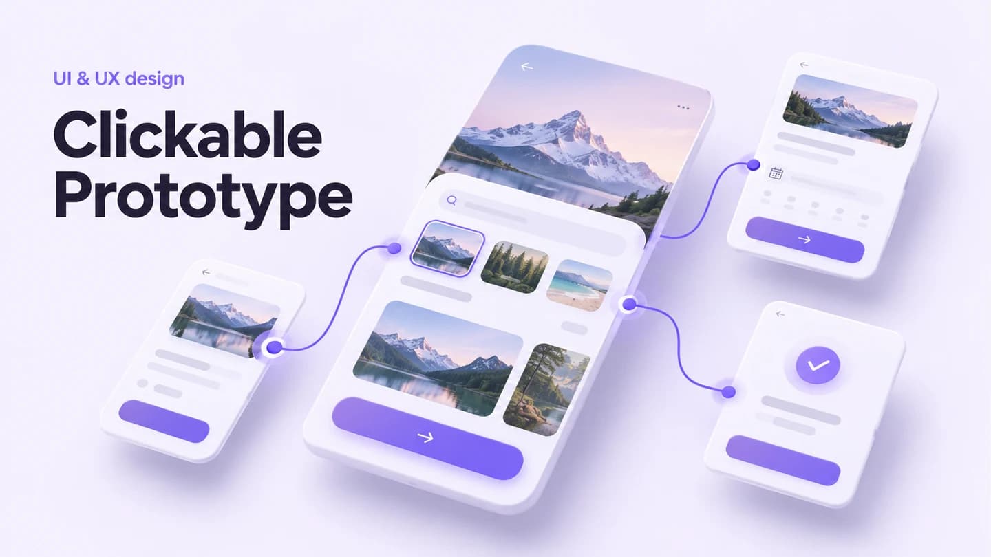
Test transitions and user flows in an interactive, realistic Figma prototype.
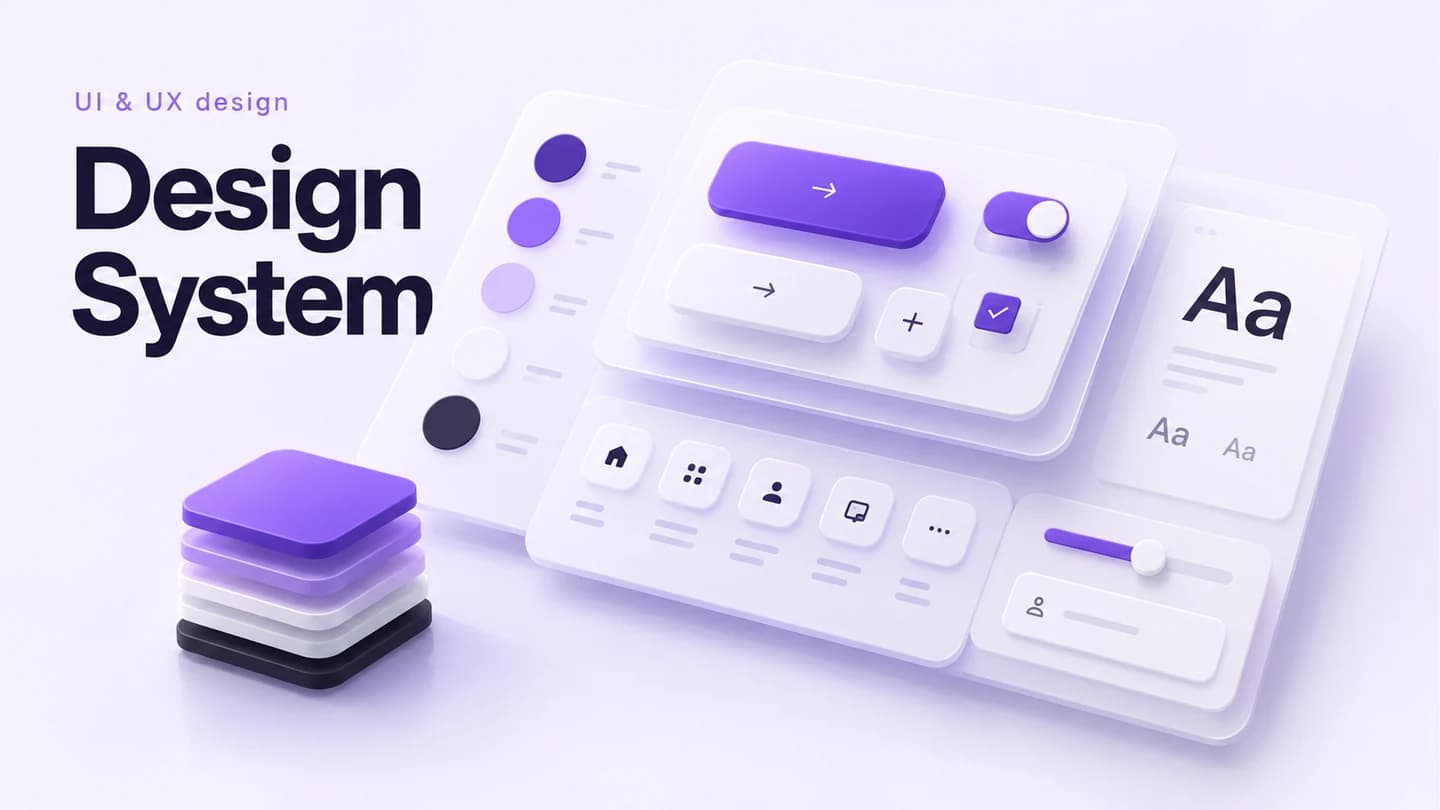
Define tokens, components, type, colours and usage rules for your product.
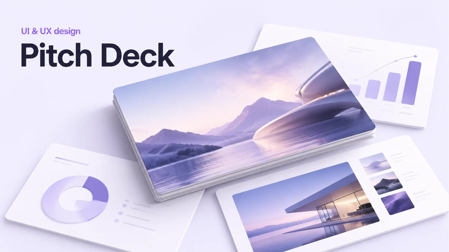
Tell an investor-ready story in 10–15 slides with clear data and visual polish.
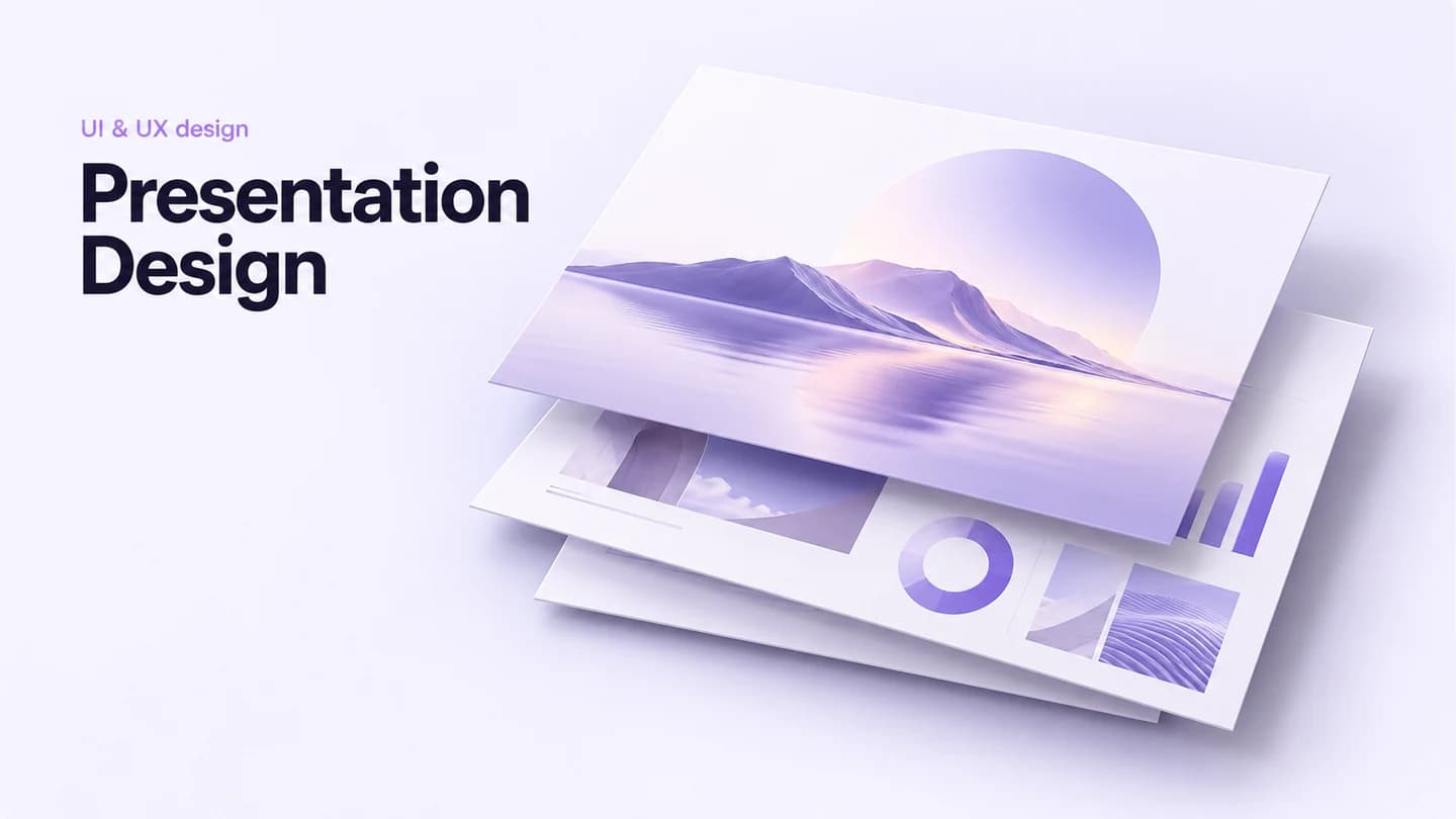
Turn your material into a clear, engaging deck for work, training or events.
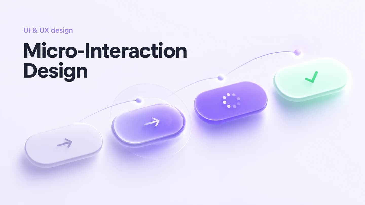
Specify button, form, loading and transition behavior for your interface.
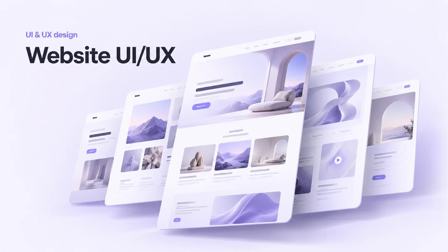
Design 10+ responsive web pages, flows, prototypes and visual rules.
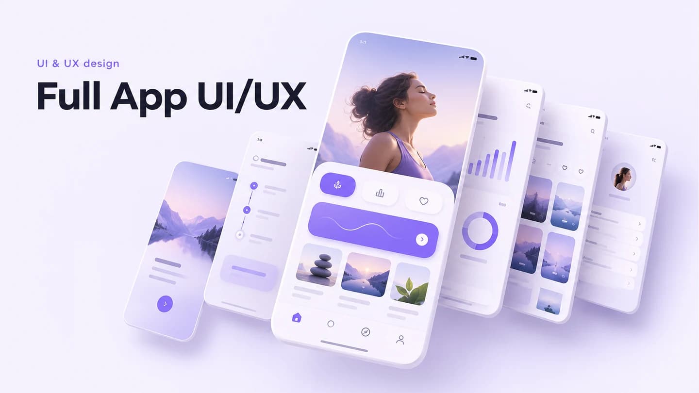
Design 15+ mobile screens with research, flows and a clickable prototype.
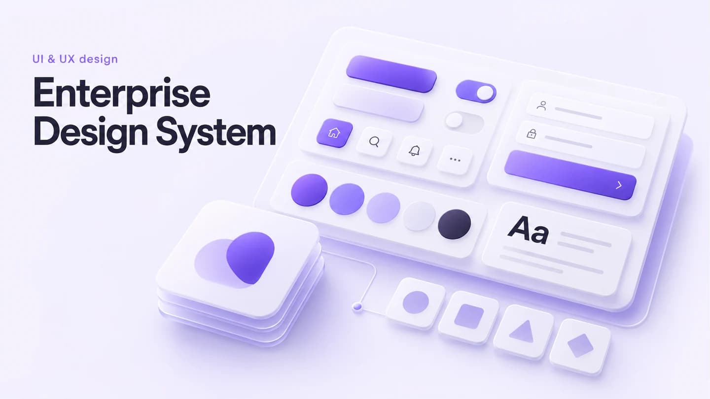
Unify brand identity and design components across products and teams.
Compare related packages by the work they actually include.
Wireframes establish layout and flow before visual polish. A clickable prototype lets people move through a proposed experience. Choose according to the decision you need to test next.
A single screen package addresses one interface. A full app UI/UX package covers a multi-screen product flow. Check the page or screen limits before choosing.