
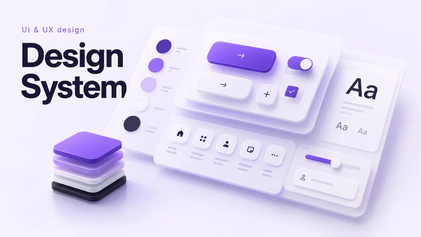
Design System
Define tokens, components, type, colours and usage rules for your product.
$715.49MRP $899.63
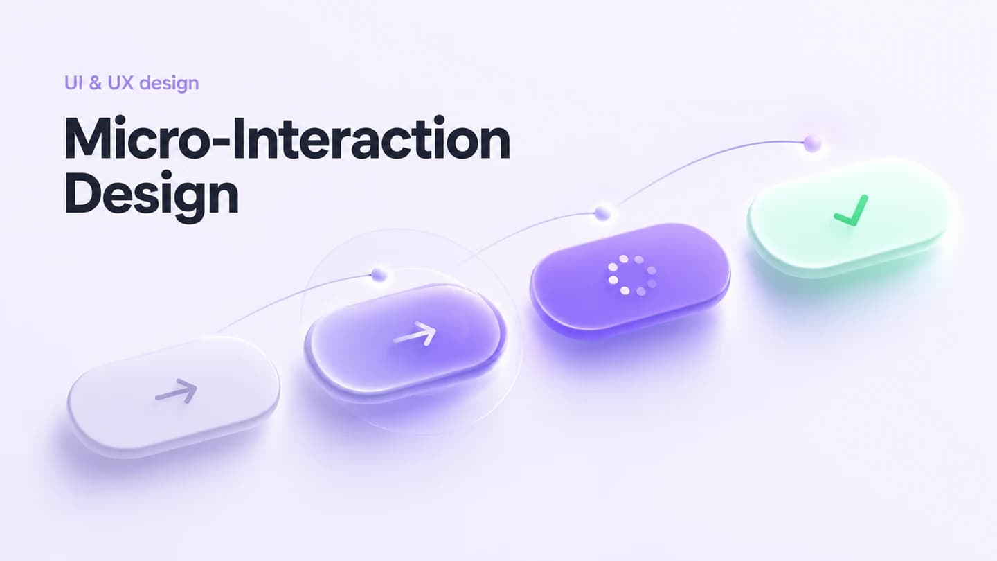
3–4 weeksDetailed micro-interaction design specifications for your product: button states, form feedback, loading animations, success/error states, and transition patterns.
In this package
Micro-interaction inventory - fully built, tested, and documented for direct use in production.
State-by-state design specs - fully built, tested, and documented for direct use in production.
Animation timing/easing specs - fully built, tested, and documented for direct use in production.
Interactive Figma prototypes - fully built, tested, and documented for direct use in production.
Developer handoff documentation - fully built, tested, and documented for direct use in production.
The plan
Full scope
Product teams wanting to add polish and delight to their user interface.
Compare other UI/UX & Product Design packagesKeep an active project moving over the weekend to meet a Monday deadline.
Design and build one more page that matches your existing site or app.
Add custom scroll, hover, page transition or loading animations to your project.
Add a new user role with its own permissions and matching interface controls.
Define tokens, components, type, colours and usage rules for your product.
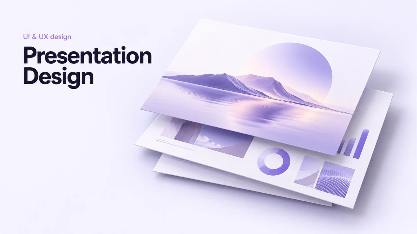
Turn your material into a clear, engaging deck for work, training or events.
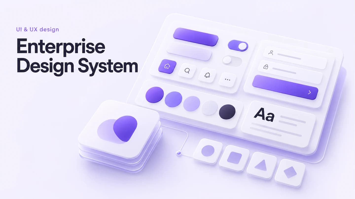
Unify brand identity and design components across products and teams.
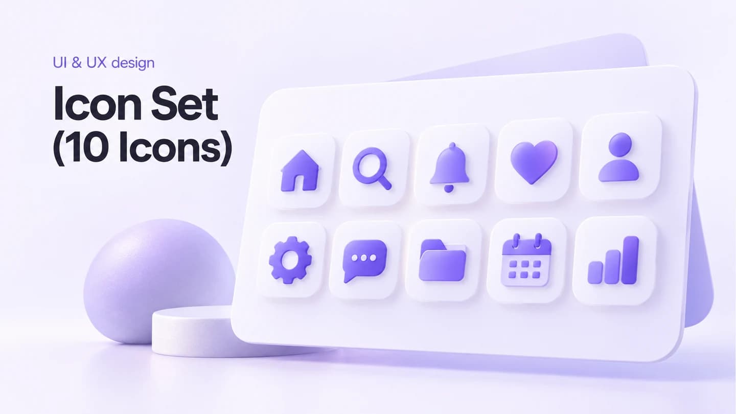
Design ten consistent brand icons in scalable SVG and multiple sizes.
Micro-interaction inventory, State-by-state design specs, Animation timing/easing specs, Interactive Figma prototypes, Developer handoff documentation
Estimated 5–7 days after kickoff